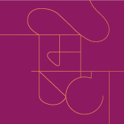
Apurva Parikh, an architect approached us to refresh his existing logo and create its stationery suite. By introducing a fresh pop of scarlet orange and using monochrome images of their projects as texture, the stationery suite balances dynamism and sophistication perfectly. Going beyond the standard business card, letterhead and envelopes, the suite includes folders, coasters, notebooks and other packaging for the various documents and formats that an architectural firm needs.


